We first encountered The Tea & Honey store in a seasonal booth in Grand Central Station, an outpost of their equally small retail store in the 43rd Street corridor of the same transportation hub in midtown Manhattan.
Retail design was aided by fun in-store messaging, branded architectural elements and a consistent packaging program touching all aspects of the brand.
Retail design was aided by fun in-store messaging, branded architectural elements and a consistent packaging program touching all aspects of the brand.
The Challenge
Started by the savvy founders of the Hamptons Honey company, the initial brand looked and felt like a homey, mom-and-pop — complete with wooden crates and baby blue walls. The owners wanted a sophisticated approach that appealed to upscale, metropolitan consumers… in New York and beyond.
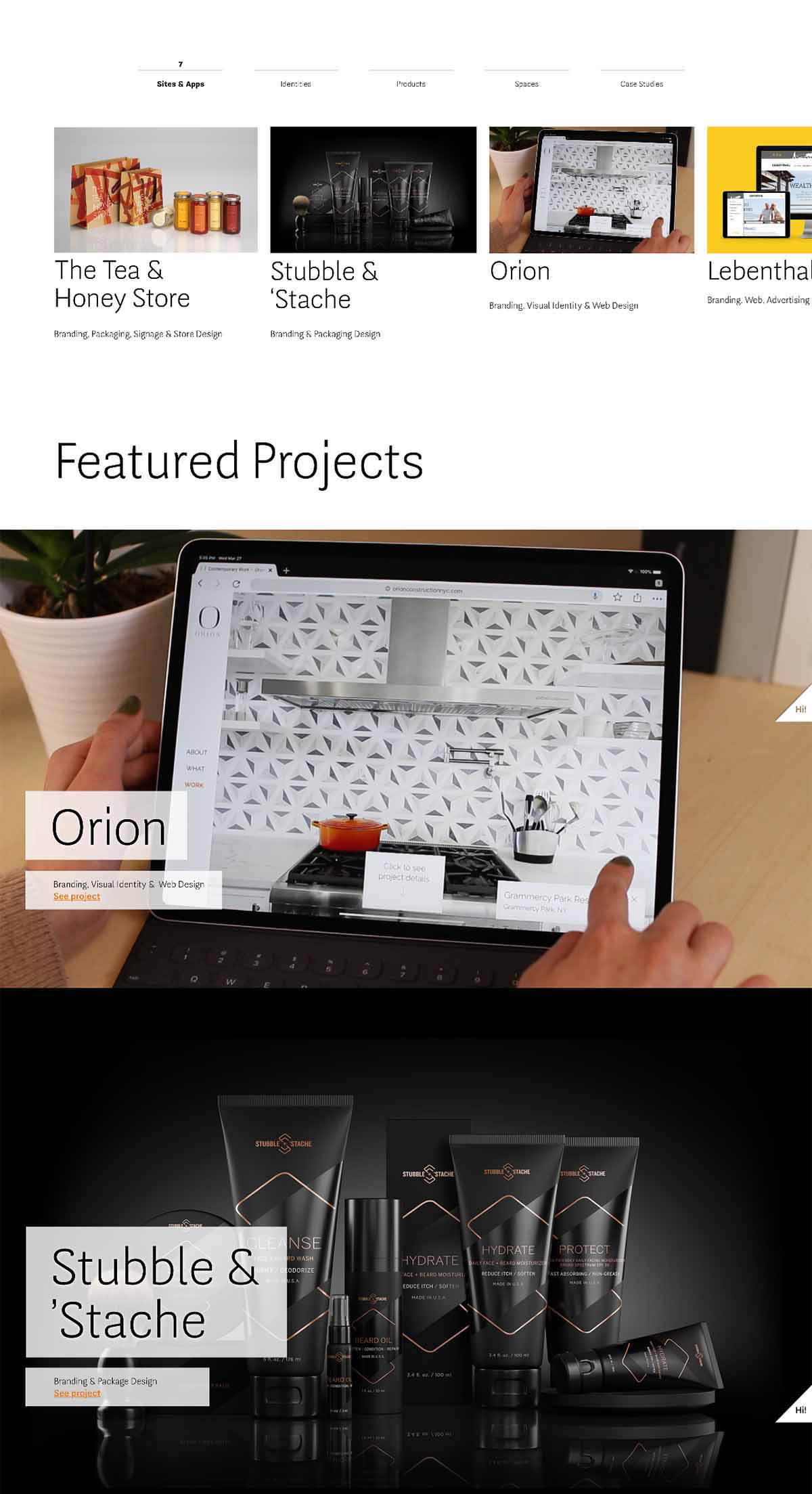
The Solution
Tea and Honey are ancient elixirs — the stories they tell are legendary (edible honey was found in Egyptian tombs… it doesn’t go bad. Go figure!). Using packaging labels, in-store signage and shopping bags as a canvas, we evolved a brand with clean and sleek lines that could also inform, be playful or just speak for itself.
Daniel Stark, Founder & Creative Director. Daniel’s diverse background in advertising, publishing, apparel and media at companies like GQ Magazine, Baron & Baron, Ann Taylor, Harper’s Bazaar and Nielsen drives his multidisciplinary approach and an uncompromising quest for simplicity.
He has created well-known campaigns, identity programs, packaging systems and digital & physical products for a diverse mix of consumer brands, services and companies including CVS Health, Prophet, Elf Cosmetics, Staples, PSFK, L’Oreal, Doremus and NYU.
Daniel is also an inventor, podcast host and author / creator of PaperMade books and products that feature flat character designs, pre-cut and pre-scored, that fold up into 3D paper toys. He lives in the greater New York City area with his family.